Visualising theoretical distributions of GLMs
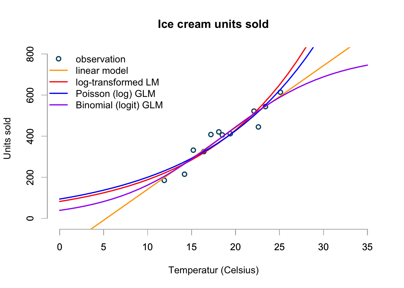
Two weeks ago I discussed various linear and generalised linear models in R using ice cream sales statistics. The data showed not surprisingly that more ice cream was sold at higher temperatures.
icecream <- data.frame(
  temp=c(11.9, 14.2, 15.2, 16.4, 17.2, 18.1,
         18.5, 19.4, 22.1, 22.6, 23.4, 25.1),
  units=c(185L, 215L, 332L, 325L, 408L, 421L,
          406L, 412L, 522L, 445L, 544L, 614L)
)
I used a linear model, a log-transformed linear model, a Poisson and Binomial generalised linear model to predict sales within and outside the range of data available.
I came to the conclusion that I preferred the binomial model for two reasons: the model simulates only whole numbers, just like the observational data and it has natural boundaries defined by zero sales and a market saturation level. Hence, it will neither predict negative sales, nor infinite sales.
However, I didn’t review any residual plots or anything else but the mean predictions. So, let’s do this in this post.
Arthur Charpentier reminded me via Twitter of an earlier post of his, where he looked at GLMs as well. Arthur used a nice 3D plot to visualise the models. I took his code and wrapped it into a function (it is not pretty, but it will do for now):
glmModelPlot <- function(x, y, xlim,ylim, meanPred,  LwPred, UpPred,
                         plotData, main=NULL){
  ## Based on code by Arthur Charpentier:
  ## http://freakonometrics.hypotheses.org/9593
  par(mfrow=c(1,1))
  n <- 2
  N <- length(meanPred)
  zMax <- max(unlist(sapply(plotData, "[[", "z")))*1.5
  mat <- persp(xlim, ylim, matrix(0, n, n), main=main,
               zlim=c(0, zMax), theta=-30,
               ticktype="detailed",box=FALSE)
  C <- trans3d(x, UpPred, rep(0, N),mat)
  lines(C, lty=2)
  C <- trans3d(x, LwPred, rep(0, N), mat)
  lines(C, lty=2)
  C <- trans3d(c(x, rev(x)), c(UpPred, rev(LwPred)),
               rep(0, 2*N), mat)
  polygon(C, border=NA, col=adjustcolor("yellow", alpha.f = 0.5))
  C <- trans3d(x, meanPred, rep(0, N), mat)
  lines(C, lwd=2, col="grey")
  C <- trans3d(x, y, rep(0,N), mat)
  points(C, lwd=2, col="#00526D")
  for(j in N:1){
    xp <- plotData[[j]]$x
    yp <- plotData[[j]]$y
    z0 <- plotData[[j]]$z0
    zp <- plotData[[j]]$z
    C <- trans3d(c(xp, xp), c(yp, rev(yp)), c(zp, z0), mat)
    polygon(C, border=NA, col="light blue", density=40)
    C <- trans3d(xp, yp, z0, mat)
    lines(C, lty=2)
    C <- trans3d(xp, yp, zp, mat)
    lines(C, col=adjustcolor("blue", alpha.f = 0.5))
  }
}
Linear model
I start by plotting the output of the linear model, a GLM assuming a Normal distribution with an identity link function.
The 3D plot shows the observations as circles on the xy-plane, together with the mean predictions as a solid line. In yellow I show the theoretical residual interval between the 5th and 95th quantile of the Normal distributions parametrised by the model output. Additionally I present the density distributions of the model at each observation.
This is conceptually similar to a Q-Q, which compares the standardised residuals with the theoretical quantiles. In the case of a linear model the prediction interval would shrink to the theoretical interval as the number of data points increases.
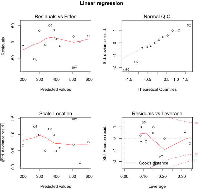
The 3D plot looks pretty, but I think it is helpful as well. Let me put this in context to the traditional residual plots, see below.
The residual plots identify observations 2, 5 and 10 as extreme points. Indeed, those points are either on the edge or outside (point 10) of the yellow area in the plot above.
xlim <- c(min(icecream$temp)*0.95, max(icecream$temp)*1.05)
ylim <- c(floor(min(icecream$units)*0.95),
          ceiling(max(icecream$units)*1.05))

lin.mod <- glm(units ~ temp, data=icecream,
                   family=gaussian(link="identity"))
par(mfrow=c(2,2))
plot(lin.mod)
title(outer=TRUE, line = -1,
      main = list("Linear regression",
                  cex=1.25,col="black", font=2))

meanPred <- predict(lin.mod, type="response")
sdgig <- sqrt(summary(lin.mod)$dispersion)

UpPred <- qnorm(.95, meanPred, sdgig)
LwPred <- qnorm(.05, meanPred, sdgig)

plotData <- lapply(
seq(along=icecream$temp),
  function(i){
    stp <- 251
    x = rep(icecream$temp[i], stp)
    y = seq(ylim[1], ylim[2], length=stp)
    z0 = rep(0, stp)
    z = dnorm(y, meanPred[i], sdgig)
    return(list(x=x, y=y, z0=z0, z=z))
  }
)

glmModelPlot(x = icecream$temp, y=icecream$units,
             xlim=xlim, ylim=ylim,
             meanPred = meanPred, LwPred = LwPred,
             UpPred = UpPred, plotData = plotData,
             main = "Linear regression")
Log-transformed linear model
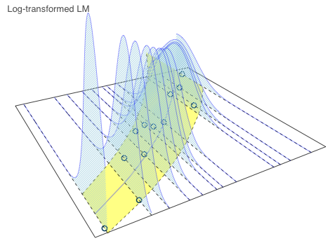
The log-transformed model shows an increasing variance around the mean as the temperatures increase. Yet, this shouldn’t come as a surprise, as this a property of the log-normal distribution. The variance is given as \(\text{Var}(X) = \exp(2\mu + \sigma^2)(\exp(\sigma^2) - 1) = \text{E}[X]^2 (\exp(\sigma^2) - 1)\) .
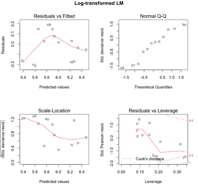
Again, the residual plots highlight points 2, 5 and 10 as extremes. I note also from the first residual plot that the log-transformed model over-predicts for colder temperatures.
log.lin.mod <- glm(log(units) ~ temp, data=icecream,
                   family=gaussian(link="identity"))
par(mfrow=c(2,2))
plot(log.lin.mod)
title(outer=TRUE, line = -1,
      main = list("Log-transformed LM",
                  cex=1.25,col="black", font=2))

meanLogPred <- predict(log.lin.mod, type="response")
sdgig <- sqrt(summary(log.lin.mod)$dispersion)

meanPred <- exp(meanLogPred + 0.5 * sdgig^2)
UpPred <- qlnorm(.95, meanlog = meanLogPred, sdlog = sdgig)
LwPred <- qlnorm(.05, meanlog = meanLogPred, sdlog = sdgig)

plotData <- lapply(
  seq(along=icecream$temp),
  function(i){
    stp <- 251
    x = rep(icecream$temp[i], stp)
    y = seq(ylim[1], ylim[2], length=stp)
    z0 = rep(0, stp)
    z = dlnorm(y, meanlog = meanLogPred[i], sdlog = sdgig)
    return(list(x=x, y=y, z0=z0, z=z))
  }
)

glmModelPlot(x = icecream$temp, y=icecream$units,
             xlim=xlim, ylim=ylim,
             meanPred = meanPred, LwPred = LwPred,
             UpPred = UpPred, plotData = plotData,
             main = "Log-transformed LM")
Poisson (log) GLM
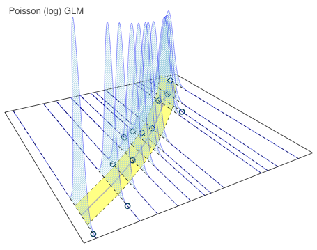
The Poisson model shows a narrower range between the 5th and 95th quantile then the previous models. My Poisson model didn’t assume over-dispersion, and hence the yellow range increases in line with the mean.
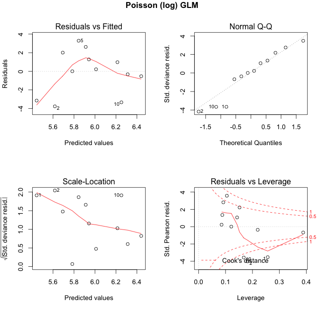
The same points 2, 5 and 10 are highlighted again as extreme, but now they are well outside the yellow area.
pois.mod <- glm(units ~ temp, data=icecream,
                family=poisson(link="log"))
par(mfrow=c(2,2))
plot(pois.mod)
title(outer=TRUE, line = -1,
      main = list("Poisson (log) GLM",
                  cex=1.25,col="black", font=2))

meanPred <- predict(pois.mod, type="response")
UpPred <- qpois(.95, meanPred)
LwPred <- qpois(.05, meanPred)

plotData <- lapply(
  seq(along=icecream$temp),
  function(i){
    y = seq(ylim[1], ylim[2])
    x = rep(icecream$temp[i], length(y))
    z0 = rep(0, length(y))
    z = dpois(y, meanPred[i])
    return(list(x=x, y=y, z0=z0, z=z))
  }
)

glmModelPlot(x = icecream$temp, y=icecream$units,
             xlim=xlim, ylim=ylim,
             meanPred = meanPred, LwPred = LwPred,
             UpPred = UpPred, plotData = plotData,
             main = "Poisson (log) GLM")
Binomial (logit) GLM
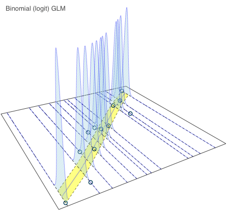
Here is my favourite model from my previous post again.
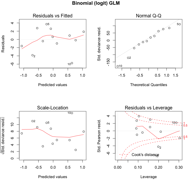
The theoretical range between the 5th and 95th quantile has narrowed further. Data item 10 looks now really suspicious. Observations 2 and 5 are once again highlighted. Now I wonder, is someone eating my ice cream?
market.size <- 800
icecream$opportunity <- market.size - icecream$units
bin.glm <- glm(cbind(units, opportunity) ~ temp, data=icecream,
               family=binomial(link = "logit"))
par(mfrow=c(2,2))
plot(bin.glm)
title(outer=TRUE, line = -1,
      main = list("Binomial (logit) GLM",
                  cex=1.25,col="black", font=2))

meanProb <- predict(bin.glm, type="response")
meanPred <- meanProb*market.size
UpPred <- qbinom(.95, market.size, meanProb)
LwPred <- qbinom(.05, market.size, meanProb)

plotData <- lapply(
  seq(along=icecream$temp),
  function(i){
    y = ylim[1]:ylim[2]
    x = rep(icecream$temp[i], length(y))
    z0 = rep(0, length(y))
    z = dbinom(y, market.size, meanProb[i])
    return(list(x=x, y=y, z0=z0, z=z))
  }
)

glmModelPlot(x = icecream$temp, y=icecream$units,
             xlim=xlim, ylim=ylim,
             meanPred = meanPred, LwPred = LwPred,
             UpPred = UpPred, plotData = plotData,
             main = "Binomial (logit) GLM")
Conclusions
I think Arthur’s 3D plots help to visualise what GLMs are conceptually about. They illustrate the theoretical distribution around the predictions. Let me say this again, the yellow areas in the charts above show not the 90% prediction interval, but the theoretical residual distribution if the models where true.Session Info
R version 3.2.2 (2015-08-14)
Platform: x86_64-apple-darwin13.4.0 (64-bit)
Running under: OS X 10.10.4 (Yosemite)

locale:
[1] en_GB.UTF-8/en_GB.UTF-8/en_GB.UTF-8/C/en_GB.UTF-8/en_GB.UTF-8

attached base packages:
[1] stats graphics grDevices utils datasets methods base

loaded via a namespace (and not attached):
[1] tools_3.2.2 Rcpp_0.12.0
Citation
For attribution, please cite this work as:Markus Gesmann (Aug 18, 2015) Visualising theoretical distributions of GLMs. Retrieved from https://magesblog.com/post/2015-08-18-visualising-theoretical-distributions/
@misc{ 2015-visualising-theoretical-distributions-of-glms,
author = { Markus Gesmann },
title = { Visualising theoretical distributions of GLMs },
url = { https://magesblog.com/post/2015-08-18-visualising-theoretical-distributions/ },
year = { 2015 }
updated = { Aug 18, 2015 }
}
