Communicating Risk and Uncertainty
David Spiegelhalter gave a fascinating talk on Communicating Risk and Uncertainty to the Public & Policymakers at the Grantham Institute of the Imperial College in London last Tuesday.
In a very engaging way David gave many examples and anecdotes from his career in academia and advisory. I believe his talk will be published on the Grantham Institute’s YouTuble channel, so I will only share a few highlights and thoughts that stuck in my mind here.Framing: Opportunity vs. Risk
Do you prefer survival ratios or mortality rates? The way you present probabilities/frequencies will make a difference in the way the audience perceives them and therefore how they will make decisions. David suggested one should aim to give a balanced view to mitigate the framing effect; e.g. show the opportunity and risk, the survival ratio and mortality rate. Interestingly, that is exactly how Wolfram Alpha displays life expectancies.
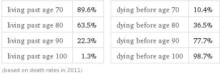 |
| Life expectance: UK, male, 62 years old (Source: Wolfram Alpha) |
Absolute and relative risk
What did you have for breakfast this morning? Fried up bacon? Perhaps you have fried up bacon every day? It could increase your chances of developing pancreatic cancer by almost a fifth, as an article by the Daily Express on 16th January 2012 suggested.
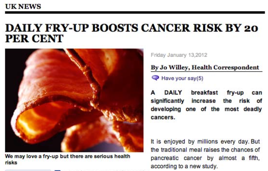 |
| Daily Express, 16th January 2012 |
Well, this might be true, but fortunately pancreatic cancer is quite rare. About 5 people out of 400 will develop this cancer even without eating fried up bacon every day (absolute risk). Eating fry ups every morning will increase your chances by 20% (relative risk) to 6 out of 400 - still pretty low. Less of a scary headline.
Small increases in absolute risks can result in large increases in relative risk. Depending on how you choose to frame the story you can generate very different reactions. David mentioned also the work of Gerd Gigerenzer, who is promoting the use of natural frequencies in the context of medical conversations, e.g. say ‘1 out of 200 people will experience a certain effect’, instead of ‘the probability for this effect is 0.5%’.Conditional probabilities
One of the big challenges in communicating risk are conditional probabilities. I believe, conditional probabilities are not intuitive for most of us. As an example David talked about breast cancer screening. The test itself is not a 100% reliable. No test is. There are always results which are false positives (test predicts cancer when there is none) and false negatives (test predicts no cancer when there is one). Tests are usually designed to have a higher false alarm rate than no alarm at all. Hence, even when the test result is positive the likelihood of cancer could be low, because cancer is rare and the test is not that good. David presented a great diagram of the NHS breast screening - Helping you decide leaflet to illustrate the conditional probabilities for breast screening.
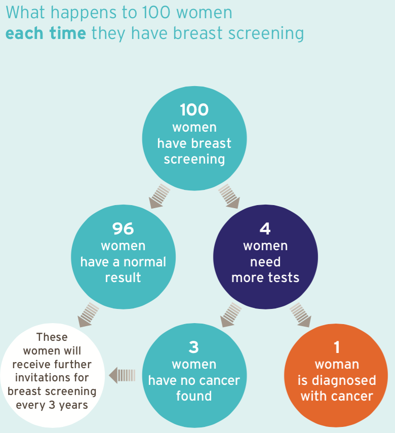 |
| NHS breast screening - Helping you decide |
Translating probabilities into words
The use of natural frequencies is not always appropriate and sometimes probabilities are more useful. However, instead of saying that something has a 50% chance of occurring, you might also say it is equally likely to happen than not. David mentioned the work of the Intergovernmental Panel on Climate Change (IPCC) that aims to use a consistent language in all their reports. To achieve that, they publish guidance on consistent treatments of uncertainty. This is their translation of probabilities into words:
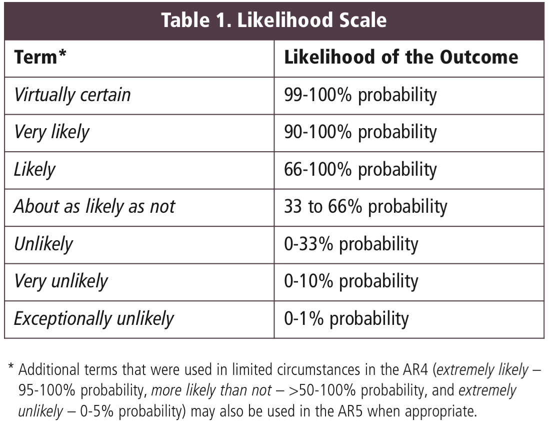 |
| Source: IPCC Uncertainty guidance note |
Speaking with confidence
The IPCC uncertainty guidance also talks about confidence and interestingly they correlate the level of agreement with the level of evidence. Note, even with a lot of evidence, without agreement the confidence is relatively low.
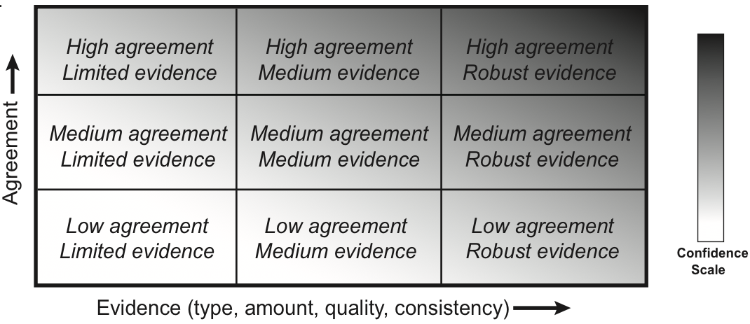 |
| Source: IPCC Uncertainty guidance note |
Fan charts
The last example from David’s talk I will mention here is the Bank of England’s fan chart of GDP projection. The Bank of England has been using this chart now for a number of years and tweaked it only a little over that time. Until the financial crisis the Bank of England showed bands of confidence within the 5-95% interval. The financial crisis happened outside that interval, which of course doesn’t mean that it couldn’t happen, it was just very unlikely. Since then they illustrate the 0-100% confidence interval as a grey background. The other interesting aspect is, that they don’t show the mean projection line initially to overcome the anchoring effect. Note also that the term projection is used and not prediction.
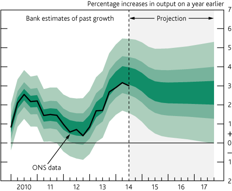 |
| November 2014 GDP Fan chart (Source: Bank of England) |
Finally, David announced that he has a new book in the pipeline. I am sure it will sell well, as it has the catchy title Sex by numbers.
Citation
For attribution, please cite this work as:Markus Gesmann (Jan 20, 2015) Communicating Risk and Uncertainty. Retrieved from https://magesblog.com/post/2015-01-20-communicating-risk-and-uncertainty/
@misc{ 2015-communicating-risk-and-uncertainty,
author = { Markus Gesmann },
title = { Communicating Risk and Uncertainty },
url = { https://magesblog.com/post/2015-01-20-communicating-risk-and-uncertainty/ },
year = { 2015 }
updated = { Jan 20, 2015 }
}