Whale charts - Visualising customer profitability
The Christmas and New Year’s break is over, yet there is still time to return unwanted presents. Return to Santa was the title of an article in the Economist that highlighted the impact on online retailers, as return rates can be alarmingly high.
The article quotes a study by Christian Schulze of the Frankfurt School of Finance and Management, which analysed the return habits of customers who bought at least five items over a five year period from a large European online retailer. Although only a few figures are cited I will attempt to create a little model that replicates the customer behaviour and visualise the impact on overall profitability.
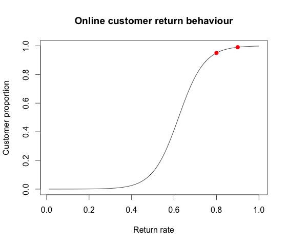
The study found that 5% of customers sent back more than 80% of items they had bought; and that 1% of customers sent back at least 90% of their purchases. Or in other words 95% of customers send back less than 80% and 99% of customers send back less than 90%. To model this behaviour an S-shape curve seems appropriate, such as the logistic curve, as no-one can return more than they bought or less than nothing. With location and scale parameters m and s the logistic function can be fitted to the data, see the R code below.
The return rates do look quite high. However, if the products were shoes rather than books then I find them believable.
Additionally the article cites studies that suggest handling each returned item costs online sellers between €6 and €18, not to mention losses from items that are returned in unsaleable condition. Furthermore, without the cost of returns, online retailer’s profits would be almost 50% higher.
Thus, to spin my toy model further, I assume 100 customers with revenues following an exponential distribution (λ=1/250), the cost ratio of sold goods to be lognormal (μ=-0.1, σ=0.1) and the cost of returns to follow a normal distribution with mean of 12 and standard deviation of 6.
In my simulation I could have made a profit of 1,979 instead of 1,441. Clearly the customers who return many items cause a real dent to my bottom line.
This situation is best visualised in what is often called a Whale Chart. Here I plot the cumulative profit against customers, with the most profitable customer on the left and the least profitable customer on the right. This chart shows me how much profit the first x number of customers generated. Often this graphs looks like a whale coming out of the water - hence its name.
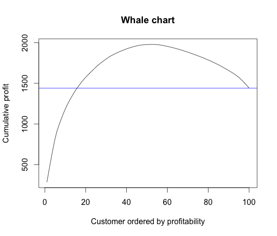
In my little toy simulation I note that the first 20 most profitable customers would have generated more profit than the revenue of all customers. Indeed, profitability could have been 37% higher if it wasn’t for loss making customers.
So, what shall I do? Manage my customers, know who I should reward and keep and who I can afford to lose. More customers are not the answer. I need more customers who return less.
R Code
Session Info
R version 3.0.2 (2013-09-25)
Platform: x86_64-apple-darwin10.8.0 (64-bit)

locale:
[1] en_GB.UTF-8/en_GB.UTF-8/en_GB.UTF-8/C/en_GB.UTF-8/en_GB.UTF-8

attached base packages:
[1] stats     graphics  grDevices utils     datasets  methods   base

loaded via a namespace (and not attached):
[1] tools_3.0.2
Citation
For attribution, please cite this work as:Markus Gesmann (Jan 07, 2014) Whale charts - Visualising customer profitability. Retrieved from https://magesblog.com/post/2014-01-07-whale-charts-visualising-customer/
@misc{ 2014-whale-charts-visualising-customer-profitability,
author = { Markus Gesmann },
title = { Whale charts - Visualising customer profitability },
url = { https://magesblog.com/post/2014-01-07-whale-charts-visualising-customer/ },
year = { 2014 }
updated = { Jan 07, 2014 }
}