UK house prices visualised with googleVis-0.2.16

A new version of googleVis has been released on CRAN and the project site. Version 0.2.16 adds the functionality to plot quarterly and monthly data as a motion chart.
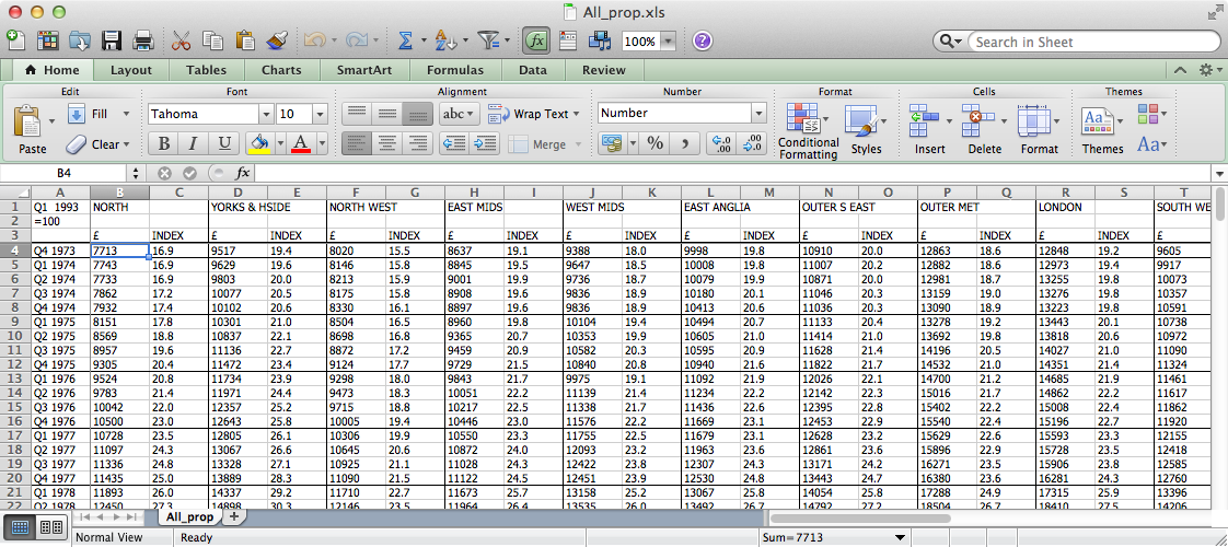
To illustrate the new feature I looked for a quarterly data set and stumbled across the quarterly UK house price data published by Nationwide, a building society. The data is available in a spread sheet format and presents the average house prices and indexed to 100 in Q1 1993 by region in the UK from Q4 1973 to Q1 2012. Unfortunately the data is formated for human eyes rather than for computers, see the screen shot below.

Never-mind, the XLConnect package by Mirai Solutions does a fabulous job in reading Excel files into R. An advantage of XLConnect, compared to other packages, is that it also works on a Mac, although I had to install the package from source (install.packages(“XLConnect”, type=“source”)).
To visualise the data in a motion chart it needs a certain structure: The time dimension has to be in one column, the regions in another and all measurements in further columns. And as I use quarterly data, I must ensure that the time dimension is given in a format understood by the Google API, which means YYYYQq, e.g. ‘2012Q1’, rather than ‘Q1 2012’ as in the Nationwide data. Once I have achieved this, see the R code for those transformations below, I can create the motion charts easily.
The motion chart of price index vs. actual amounts shows some interesting patterns, in particular how the relativity between the regions has widened, the impact of the financial crisis in 2008 and its severity on Northern Ireland.
I can investigate the data further by changing the view of the motion chart into a line chart.
Yorkshire & Humberside seems to have deteriorate the most over the past 39 years. The same region was still in line with the UK average 20 years ago, but since then it has dropped to 81% in Q1 2012. Of course living in London has always been more expensive than in other regions, in some cases it is twice as expensive to buy a property in London than elsewhere today. Anna Powell-Smith developed a nice application analysing the correlation between house prices and train times to London in more detail.
Switching the chart to an index basis amplifies the housing bubble in Northern Ireland. The index reached 652 in Q2 2007 and has since crashed to 317 and unlike in other regions its downward trend hasn’t stopped yet.
The last downturn in the UK lasted from Q4 1989 to Q1 1993 and if history would repeat itself, it would suggest that prices might raise again soon. However, Robert Gardner, chief economist at Nationwide, was quoted in the FT a few weeks ago saying that “The challenging economic backdrop suggests that a significant acceleration in prices or activity is unlikely near term”.
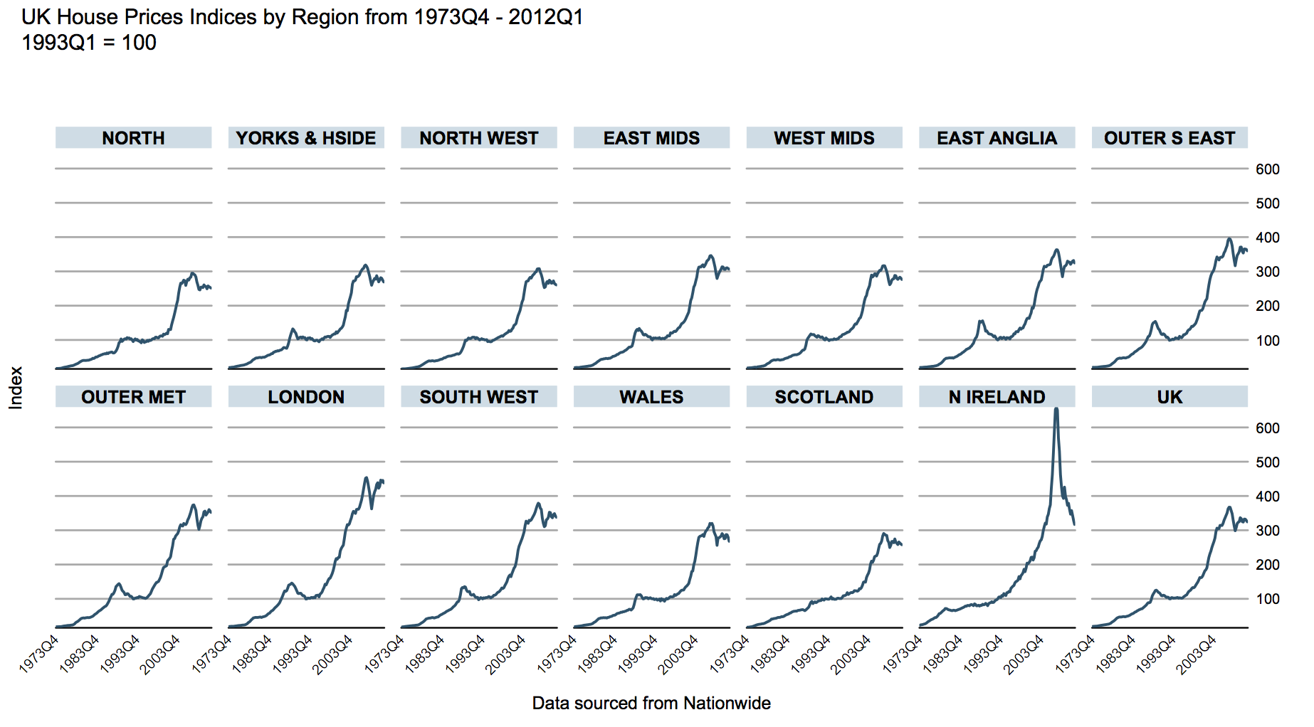
Last but not least, a traditional lattice plot of the house price indices for the readers on iOS ;-)

As usual, here is the R code of this post.
Citation
For attribution, please cite this work as:Markus Gesmann (Jun 05, 2012) UK house prices visualised with googleVis-0.2.16. Retrieved from https://magesblog.com/post/2012-06-05-uk-house-prices-visualised-with/
@misc{ 2012-uk-house-prices-visualised-with-googlevis-0.2.16,
author = { Markus Gesmann },
title = { UK house prices visualised with googleVis-0.2.16 },
url = { https://magesblog.com/post/2012-06-05-uk-house-prices-visualised-with/ },
year = { 2012 }
updated = { Jun 05, 2012 }
}