Show me the data! Or how to digitize plots
Of course there are perfectly valuable reasons for only displaying a chart and not making the underlying data available, e.g. to generate leads, as potential customers may get in touch with you asking for the underlying data, or technology issues that don’t allow you to upload data, etc.
I personally believe that when I show a chart I should also make the underlying data available. Pretty pictures give you the attention, but the underlying data will offer you an opportunity to engage with your reader on a different level. This might be similar to open source software. In most cases users don’t want to see and read the code, but having the knowledge that they could provides more credibility.
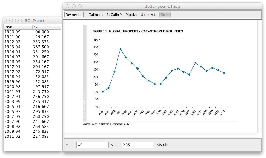
Screen shot of plot digitizer using Guy Carpenter’s global property catastrophe rate on line index
Here is another reason why I should make the data available: Because it is easy to extract the data from a chart anyhow, thanks to digitizing software like the Java application plot digitizer. While in the past I may have used graph paper and a ruler, nowadays it only takes a few minutes to extract the information.
Citation
For attribution, please cite this work as:Markus Gesmann (Feb 27, 2012) Show me the data! Or how to digitize plots. Retrieved from https://magesblog.com/post/2012-02-27-show-me-data-or-how-to-digitize-plots/
@misc{ 2012-show-me-the-data-or-how-to-digitize-plots,
author = { Markus Gesmann },
title = { Show me the data! Or how to digitize plots },
url = { https://magesblog.com/post/2012-02-27-show-me-data-or-how-to-digitize-plots/ },
year = { 2012 }
updated = { Feb 27, 2012 }
}