Setting the initial view of a motion chart in R
Following on from my article about accessing and plotting World Bank data with R I want to talk about how to change the initial view of a motion chart.
Over the last couple of weeks I have been asked a view times how to do this. For instance Stephen O’Grady wanted to create a motion chart, which shows initially a line chart, rather than a bubble chart.
Changing the initial settings of a motion chart is actually quite easy, if you know how to. The trick is to use the state argument in the list of options of gvisMotionChart.
As a case study I will use the World Bank data set and try to do some homework given by Duncan Temple Lang in his course on introduction to statistical computing course. Duncan asked his students to query the World Bank data base to create a line chart, which would show the number of internet users per 1000 in Africa over time. Further, he would like to see a legend next to the chart to identify which country is which and tooltips for each curve to identify the country.
A motion chart, displayed as a line chart, would do the trick.
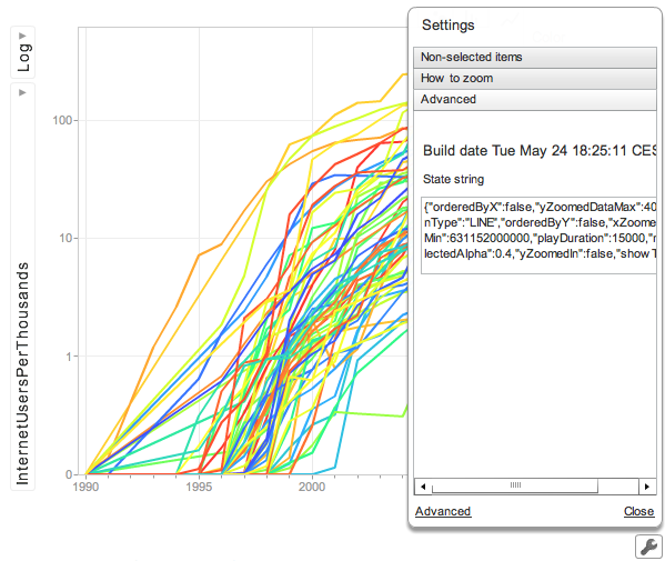
Okay, getting the data is easy, thanks to the WDI package, or via a direct download, and so it is to create a motion chart with bubbles. Interactively I can change the bubble chart into a line chart, I can select some countries and change the y-axis to log-scale. However, when I reload the page I am back to square one: a bubble chart. So the idea is to pass the changed chart settings on to the initial plot. I find those settings, of the current view, as a string in the advanced tab of the settings window. I click on the wrench symbol in the bottom right hand corner of a motion chart to access this window.
 |
| Screen shot the settings window of a motion chart |
Next I copy this string and paste it into the state argument of the options list. Note the line break at the beginning and at the end of the state string in the example. Alternatively I can add to both side of the state string.
Here is an example, where I pre-selected Sierra Leone and Seychelles (countries with the lowest and highest number of internet users) together with Africa, North Africa and Sub-Saharan Africa (all income levels). You find the R code below to replicate the plot.
What does the data tell you? Play around with the graph, e.g. change it to a column graph, deselect all countries and change the y-axes to linear again, and hit the play button. How could we improve the plot?
For more details about the googleVis package see the vignette, and for more details about motion charts and its option see also the Google Visualisation API documentation.
Session Info
sessionInfo()
R version 2.13.1 Patched (2011-08-14 r56742)
Platform: x86_64-apple-darwin9.8.0/x86_64 (64-bit)

locale:
[1] en_GB.UTF-8/en_GB.UTF-8/C/C/en_GB.UTF-8/en_GB.UTF-8

attached base packages:
[1] stats     graphics  grDevices utils     datasets  methods   base

other attached packages:
[1] googleVis_0.2.10 RJSONIO_0.95-0

loaded via a namespace (and not attached):
[1] tools_2.13.1
Citation
For attribution, please cite this work as:Markus Gesmann (Sep 30, 2011) Setting the initial view of a motion chart in R. Retrieved from https://magesblog.com/post/2011-09-30-setting-initial-view-of-motion-chart-in/
@misc{ 2011-setting-the-initial-view-of-a-motion-chart-in-r,
author = { Markus Gesmann },
title = { Setting the initial view of a motion chart in R },
url = { https://magesblog.com/post/2011-09-30-setting-initial-view-of-motion-chart-in/ },
year = { 2011 }
updated = { Sep 30, 2011 }
}